
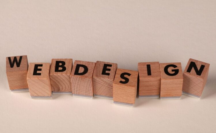
Dhanbad Web Design Typography Trends 2024
Are you wondering how to make your Dhanbad website truly stand out in 2024? The secret often lies in something fundamental yet frequently overlooked: typography. Understanding the latest Dhanbad web design typography trends isn’t just about aesthetics; it’s about crafting an online presence that captures attention, communicates effectively, and builds trust with your local audience. This guide will walk you through the crucial role of fonts, global trends, and how to apply them specifically for businesses in Dhanbad.
Why is Typography Crucial for Dhanbad Web Design?
Typography isn’t just about choosing pretty fonts; it’s the visual voice of your brand. For any business in Dhanbad, from local retailers to industrial services, effective typography directly influences how your message is perceived and remembered. Oliver Reichenstein, of Information Architects, famously stated that “95% of web design is typography,” underscoring its foundational importance in digital product design.
Strong typography builds immediate credibility and guides the user’s eye through your content. A study in the International Design Journal (2020) highlighted the cognitive influence of typography on information retention and comprehension, meaning clear fonts help your audience absorb your message better. When your website’s text is easy to read and visually appealing, it significantly enhances the user experience typography, making visitors more likely to engage and convert. For local businesses, this translates directly to customer trust and engagement.
What Are the Latest Global Typography Trends in Web Design?
The digital landscape is constantly evolving, and web typography is no exception. Staying updated on these global movements allows Dhanbad web designers to create contemporary and engaging sites. Here’s a look at what’s shaping web aesthetics in 2024 and beyond:
The Rise of Variable Fonts
Variable fonts are revolutionizing responsive web fonts by allowing designers unprecedented flexibility. Instead of multiple font files for different weights and styles, a single variable font file contains an entire spectrum of design possibilities. Brands like Google and Apple have already embraced variable fonts for their versatility and ability to create seamless, responsive designs that adapt effortlessly across various devices. Monotype’s 2024 Global Font Use Survey indicates that 68% of participants are now using font subscription services, highlighting a growing interest in this technology for efficiency and creative freedom. James Clarke, Design Director at Bandstand, foresees an expansion of variable fonts that allow “dialling up or down the details within the face itself; not just limited to width, weight or skew” in 2025.
Expressive Serifs and Playful Sans-Serifs
While sans-serifs dominate the web (85% preference for readability, according to one analysis of 1000 websites), expressive serifs are making a bold comeback. Brands like Vogue and Airbnb are utilizing expressive serifs to convey sophistication with a modern twist, breaking away from traditional molds. Simultaneously, quirky sans typefaces continue to gain traction. Mark Richardson, Founder of Superfried, predicts a continuation of “quirky sans typefaces” in 2024, noting that “previously reluctant clients will be more open to this direction when presented with the risk of not being seen in a sea of sans.” This trend allows for greater brand personality fonts and visual interest.
Oversized and Bold Typography
To capture attention in a crowded digital space, designers are increasingly opting for bold and oversized typography. Companies like Spotify and Slack leverage this trend to enhance brand personality and create immediate visual impact in their user interfaces. This approach, often combined with larger font sizes (preferred by 94% of designers, with 76% combining both size and weight for emphasis), ensures key messages are instantly legible and memorable. The U.S. Web Design System recommends at least an effective size of 16px for most body text to ensure readability, a guideline that aligns with this larger text trend.
Custom Typefaces for Unique Brand Identity
As businesses strive for unique brand identity fonts, custom typefaces are becoming a significant trend. James Clarke notes that “the big story of recent years has been the rise of custom type, and it’s a trend that shows no sign of slowing down.” Nike, for instance, partnered with Pizza Typefaces for a custom font for the 2024 Paris Olympics, embodying speed and flexibility. Similarly, the Guggenheim Museum developed “Guggenheim Sans” for consistent branding across its global presence. For businesses in Dhanbad, a custom typeface can offer an unparalleled level of distinction, though it often comes with a higher investment.
How to Localize These Typography Trends for Dhanbad Businesses?
Applying global trends to the specific needs of Dhanbad’s market requires thoughtful localization. It’s about adapting these cutting-edge styles to resonate with local sensibilities and business objectives. For instance, a bold, modern brand identity graphic design Dhanbad might use an expressive serif for a high-end boutique, while a local coaching center could benefit from a friendly, approachable sans-serif.
Consider the target audience for Dhanbad web design typography trends. What message do you want to convey? A reputable industrial supplier in Dhanbad might use strong, clean sans-serifs like Inter or Poppins to signal reliability and modernity. Conversely, a startup targeting a younger demographic could experiment with playful, quirky sans-serifs, aligning with Mark Richardson’s observation about clients being more open to distinctive typefaces.
Localization also means considering the practical constraints of local businesses. While custom typefaces offer ultimate distinction, affordable typography Dhanbad solutions often involve leveraging the vast libraries of Google Fonts for web. These provide high-quality, free options that can still achieve a modern aesthetic when chosen wisely and paired effectively.
Finding Affordable & Accessible Fonts for Your Dhanbad Website
Budget constraints are a reality for many local businesses, but this doesn’t mean compromising on quality web typography. The key is knowing where to look for affordable web design packages for Dhanbad small businesses that prioritize both aesthetics and functionality.
Google Fonts for web is an invaluable resource for designers in Dhanbad. It offers a massive library of high-quality, open-source fonts that are free to use and optimized for web performance. Popular choices like Open Sans, Lato, and Roboto are excellent starting points for body text due to their clarity and widespread browser support. Jessica Strelioff and Danielle LaRoy of Goodside Studio predict a “rise in open source fonts and foundries in 2024,” driven by tightening client budgets and the increasing number of creative touchpoints.
When selecting fonts, always prioritize web typography accessibility. This means choosing fonts with clear letterforms, good contrast, and sufficient sizing to ensure readability for all users, regardless of device or visual ability. The US Web Design System recommends a minimum effective size of 16px for body text, a standard easily met with many Google Fonts.
Which Typography Styles Resonate with Dhanbad’s Culture & Industries?
Dhanbad, with its rich industrial heritage and growing educational sector, presents a unique context for typography choices. Understanding these nuances helps create websites that truly connect with the local audience.
For industries like mining or heavy machinery, a website needs to convey trustworthiness, strength, and professionalism. Here, robust sans-serifs like Oswald or Montserrat, used with appropriate weighting, can effectively communicate reliability. These can be paired with a subtle, modern serif for headlines to add a touch of established authority without feeling dated.
Educational institutions or local retail shops, on the other hand, might opt for fonts that convey approachability, modernity, or even a sense of community. Friendly sans-serifs such as Nunito Sans or Poppins work well for body text, while a slightly more expressive font could be used for headings to add character. The goal is to select fonts that align with the specific values and target demographic of each Dhanbad business, ensuring the visual message is consistent with the brand’s mission.
What is the Future of Typography in Web Design?
The trajectory of typography in web design points towards greater dynamism, personalization, and efficiency. We’re moving beyond static text to interactive and adaptive experiences.
Variable fonts will continue to evolve, offering designers even more granular control over typographic expression. This means websites will be able to adapt not just in size and weight, but in subtle stylistic details, creating truly unique and responsive experiences across all devices. Bhuiyan, a designer on 99designs by Vista, states that “Dynamic typography variable fonts and kinetic typography that responds to user interaction—creates personalized, living experiences where text itself becomes an interactive element rather than static content.”
Expect to see more experimentation with 3D typography and animated text, especially as web technologies advance. These elements can add a layer of interactivity and engagement that static text cannot. However, for most Dhanbad web design projects, the focus will remain on practical, performant, and accessible solutions that leverage the growing capabilities of tools like variable fonts and intelligent font pairing strategies.
Best Font Combinations for Modern Dhanbad Web Design
Choosing individual fonts is one thing; combining them effectively is an art. Good font pairing strategies create visual hierarchy and enhance the overall aesthetic without clashing. Here are some effective combinations using popular and accessible fonts suitable for Dhanbad web design:
- Classic & Professional:
- Heading: Roboto Slab (a robust slab serif)
- Body: Roboto (a clean, highly readable sans-serif)
- Why it works: Provides strong contrast and a balanced blend of modern professionalism with excellent readability, ideal for corporate or educational sites.
- Modern & Minimalist:
- Heading: Inter (a versatile, clear sans-serif)
- Body: Open Sans (a highly legible, neutral sans-serif)
- Why it works: Both are excellent for responsive typography local websites. This pairing offers a clean, contemporary look with fantastic web font readability Dhanbad businesses can rely on.
- Expressive & Approachable:
- Heading: Playfair Display (an elegant, expressive serif)
- Body: Lato (a friendly, humanist sans-serif)
- Why it works: The expressive serif adds character for headlines, while Lato ensures excellent body text readability. This combination is great for creative agencies or lifestyle brands.
The short answer is to aim for contrast in weight, style, or size, but always ensure harmony. Nunito Sans or Open Sans are often recommended as neutral fonts for paragraphs and captions to maintain clarity and professionalism, allowing your display typefaces to truly shine.
Ensuring Readability and Accessibility in Web Typography
Beyond aesthetics, the primary goal of web typography is to communicate effectively. This means prioritizing web font readability Dhanbad users expect and deserve. Accessibility is not just a best practice; it’s a legal and ethical imperative, especially for public-facing websites.
Here’s how to ensure your typography is both readable and accessible:
- Font Size: As mentioned, aim for at least 16px for body text. Larger sizes are often better, especially for diverse audiences. Designers lean towards larger font sizes (94%) over heavier weights (82%).
- Line Height (Leading): Ensure sufficient space between lines of text. A line-height of 1.5 to 1.8 times the font size is a good starting point for optimal reading flow.
- Contrast: Always ensure a high contrast ratio between text color and background color. Tools are available online to check this against WCAG (Web Content Accessibility Guidelines) standards.
- Font Choice: Select fonts with clear, distinct letterforms. Overly decorative or thin fonts can hinder readability, especially on smaller screens.
- Responsive Design: Your typography must adapt seamlessly to different screen sizes. This is where responsive web design Jharkhand principles come into play, ensuring text remains legible on mobile, tablet, and desktop.
What most people miss is that good typography accessibility doesn’t limit creativity; it guides it towards more effective and inclusive design. By focusing on these principles, you ensure your Dhanbad web design typography trends serve every visitor.
Frequently Asked Questions
What are the latest typography trends in web design?
The latest typography trends in web design include the widespread adoption of variable fonts for flexibility, the resurgence of expressive serifs, and the continued popularity of bold and oversized sans-serifs for impact. Custom typefaces are also on the rise, allowing brands to forge unique visual identities. These trends prioritize both aesthetic appeal and enhanced user experience.
What are the best fonts for web design 2024?
For modern web design in 2024, popular and highly effective fonts include Inter and Poppins for clean, minimalist sans-serifs, and Open Sans, Lato, and Roboto for versatile, readable body text. Expressive serifs like Playfair Display are also excellent for headlines. These fonts are often available through Google Fonts, making them accessible and high-performing.
What is the future of typography?
The future of typography points towards more dynamic, interactive, and personalized experiences, largely driven by advancements in variable fonts and kinetic typography. This will allow text to adapt not just in size and weight, but also in subtle stylistic details, creating living, responsive content. We can also expect continued experimentation with 3D and animated text to enhance user engagement.
What is the importance of typography in web design?
Typography is critically important in web design because it forms the visual foundation of communication and brand identity. It significantly impacts readability, user experience, and how information is perceived and retained. Good typography builds trust and guides users, while poor choices can deter engagement, making it a cornerstone of effective digital presence.
Mastering Dhanbad web design typography trends is about more than just keeping up; it’s about strategically enhancing your online presence. By embracing modern font choices, prioritizing readability, and localizing global trends, your website can communicate your brand’s message with clarity and impact. Ready to transform your website’s visual voice? Connect with web design experts in Dhanbad to implement these cutting-edge typography strategies today.

Write a Comment