

Unlocking Color Psychology in Design
In the vibrant world of graphic design, color is more than just a visual element; it’s a powerful tool that can influence emotions, convey messages, and shape perceptions. Understanding the psychology of color can elevate your designs, making them more impactful and resonant with your audience. Therefore, let’s delve into the fascinating realm of color psychology and discover how you can harness its power in your graphic design projects.
The Emotional Impact of Colors
Colors evoke emotional responses that are often universal but can also be influenced by cultural associations and personal experiences. Here’s a breakdown of some common colors and the emotions they typically evoke:
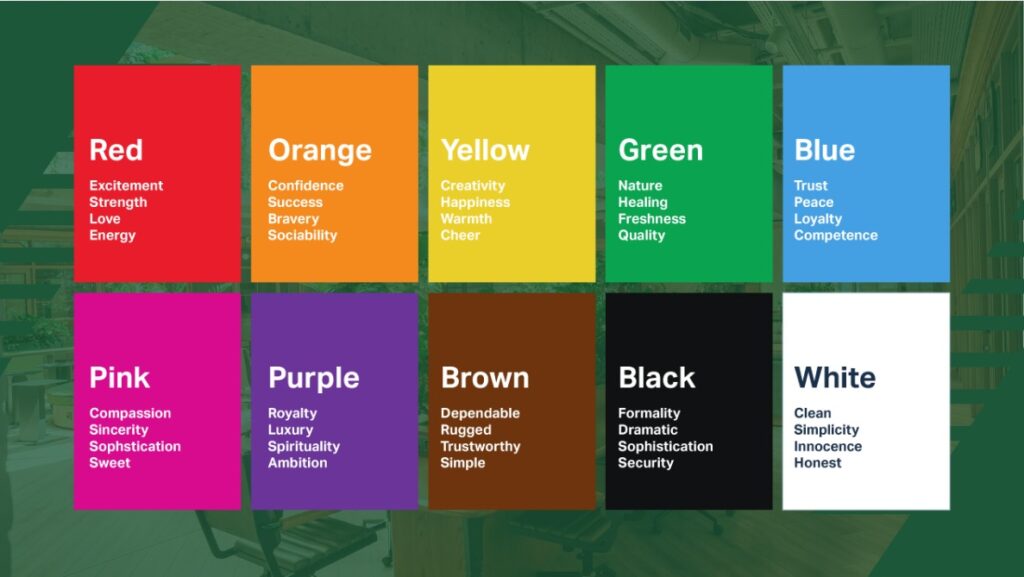
Red: Passion and Urgency
Red is a dynamic and intense color, often associated with passion, excitement, and urgency. It can increase heart rates and create a sense of immediacy, making it perfect for calls to action, sale announcements, and elements that require immediate attention.
Blue: Trust and Calm
Blue is known for its calming effect and is often associated with trust, reliability, and professionalism. It’s no wonder that many financial institutions and tech companies use blue in their branding to evoke a sense of security and dependability.
Yellow: Happiness and Energy
Yellow exudes warmth and positivity, symbolizing happiness, energy, and optimism. It’s an excellent choice for designs that aim to uplift and energize the viewer. However, use it sparingly as too much yellow can lead to feelings of anxiety.
Green: Growth and Harmony
Green represents nature, growth, and tranquility. It’s a versatile color that can convey a sense of freshness and environmental consciousness, making it ideal for brands associated with health, wellness, and sustainability.
Black: Sophistication and Authority
Black is both powerful and elegant, often used to convey sophistication, luxury, and authority. It adds a sense of depth and seriousness to designs, making it a popular choice for high-end brands and products.
White: Purity and Simplicity
White is associated with purity, simplicity, and cleanliness. It’s often used in minimalist designs to create a sense of openness and space. Moreover, white can act as a neutral background that allows other colors to stand out.
Purple: Creativity and Luxury
Purple combines the calmness of blue and the intensity of red, symbolizing creativity, luxury, and wisdom. It’s a color that can add a touch of elegance and imagination to your designs.
Orange: Enthusiasm and Warmth
Orange is energetic and enthusiastic, blending the excitement of red and the cheerfulness of yellow. It’s a friendly and inviting color, great for designs that aim to be approachable and fun.
Cultural Influences on Color Perception
While certain color associations are universal, cultural differences can significantly impact how colors are perceived. For instance, white signifies purity and peace in Western cultures but can represent mourning and death in some Eastern cultures. Similarly, red is often associated with good luck and prosperity in China, whereas it can signify danger or warning in other contexts.
When designing for a global audience, it’s crucial to research and understand the cultural connotations of colors in your target markets. This awareness ensures your designs communicate the intended message without inadvertently causing offense or misunderstanding.
Practical Applications in Graphic Design
Branding and Identity
Choosing the right colors for a brand’s identity is crucial. Colors should align with the brand’s values and the emotions it aims to evoke in its audience. A well-thought-out color palette can differentiate a brand and create a lasting impression.
User Interface (UI) Design
In UI design, color can guide users’ actions and improve their experience. For instance, using contrasting colors for buttons and important elements can make navigation more intuitive and highlight key actions.
Marketing and Advertising
Colors play a pivotal role in marketing and advertising. They can attract attention, convey messages quickly, and influence consumer behavior. For example, red is often used in clearance sales to create a sense of urgency, while blue might be used in advertisements for tech products to convey reliability.
Product Packaging
The colors used in product packaging can affect consumer perceptions and buying decisions. Bright, vibrant colors can make products stand out on shelves, while subdued, earthy tones might appeal to environmentally conscious consumers.
Tips for Using Color Effectively
- Understand Your Audience: Research your target audience’s preferences and cultural backgrounds to choose colors that will resonate with them.
- Maintain Consistency: Use a consistent color palette across all branding materials to build brand recognition.
- Consider Contrast: Ensure there is enough contrast between text and background colors for readability.
- Test and Iterate: Test different color combinations and gather feedback to see what works best for your audience.
Conclusion
The psychology of color is a powerful aspect of graphic design that can greatly enhance the effectiveness of your work. By understanding the emotional and cultural impacts of colors, you can create designs that not only catch the eye but also resonate deeply with your audience. Whether you’re working on branding, UI design, marketing materials, or product packaging, thoughtful color choices can make all the difference in conveying your message and achieving your design goals.
Embrace the power of color and let it transform your graphic design projects into compelling, emotionally engaging, and culturally aware masterpieces.
“Colors speak all languages in the design world, shaping emotions and perceptions with every hue.”

Write a Comment